Vite Setup with Styled-Components - Part 4
You can skip this one if you want, I’m only doing it because I prefer styled components much more than other things like Tailwind…(please don’t!). To start, let’s just add styled-components to our project.
yarn add styled-components && yarn add @types/styled-components -D
Let’s create a folder from the src root called styles and add two files: resets.ts and theme.ts.
└── styles
  └── resets.ts
  └── theme.ts
In reset we’ll have these styles here that will reset some things that will actually be the base for our css.
resets.ts:
import { createGlobalStyle } from "styled-components";

const ResetStyles = createGlobalStyle`


 html,
 body {
   padding: 0;
   margin: 0;
   font-family: 'Playfair Display', serif;
   background-color:  #f6f6f0;
 }


 a {
   color: inherit;
   text-decoration: none;
 }


 * {
   box-sizing: border-box;
 }


`;

export default ResetStyles;
And in the theme file let’s leave it this way:
export default {
  colors: {
    primary: "tomato",
  },
  spacings: {
    small: "1rem",
    medium: "2rem",
    large: "3rem",
  },
};
In our main we’ll need to call the StyledComponent Provider so that our entire project can receive/have access to the theme file we created:
import React from "react";
import ReactDOM from "react-dom/client";
import { ThemeProvider } from "styled-components";

import ResetStyles from "styles/reset";
import theme from "styles/theme";

import App from "./App";

ReactDOM.createRoot(document.getElementById("root") as HTMLElement).render(
  <React.StrictMode>
    <ThemeProvider theme={theme}>
      <ResetStyles />
      <App />
    </ThemeProvider>
  </React.StrictMode>
);
After that, let’s create another folder at the src root called types, where we’ll declare the types so they can be seen and accessed throughout our entire project and in it declare the following type: styled-components.d.ts
└── types
  └── styled-components.d.ts
import theme from "styles/theme";

type Theme = typeof theme;

declare module "styled-components" {
  // eslint-disable-next-line @typescript-eslint/no-empty-interface
  export interface DefaultTheme extends Theme {}
}
After that, we’ll create a component called Content that will only be used to give our App.js some breathing room with some paddings. And we’ll have only two files inside our component:
└── components
  └── Content
    └── index.tsx
    └── styles.tsx
styles.tsx:
import styled, { css } from "styled-components";

export const Wrapper = styled.main`
  ${({ theme }) => css`
    padding: ${theme.spacings.small};
  `};
`;
if you look carefully, theme is being passed by our provider and being received in our wrapper and thus we guarantee the value of our padding.
index.tsx:
import * as S from "./styles";

export const Content = ({ children }: { children: React.ReactNode }) => {
  return <S.Wrapper className="content">{children}</S.Wrapper>;
};
In our Counter component we’ll make some new changes
styles.tsx:
import styled from "styled-components";

export const Button = styled.button`
  background-color: ${({ theme }) => theme.colors.primary};
  color: white;
  font-size: 1.5rem;
  padding: 0.5rem 1rem;
  border: none;
  border-radius: 0.5rem;
  cursor: pointer;
`;
import { useState } from "react";

import * as S from "./styles";

export const Counter = () => {
  const [count, setCount] = useState(0);

  return (
    <div>
      <S.Button onClick={() => setCount((count) => count + 1)}>
        count is: {count}
      </S.Button>
    </div>
  );
};
And finally, I made some more changes to our App.js and it looked like this:
import { Content } from "components/Content";
import { Counter } from "components/Counter";

function App() {
  return (
    <Content>
      <Counter />
    </Content>
  );
}

export default App;
Now, to not break our storybook, we need to make a wrapper for it in preview.cjs, which we’ll need to rename to preview.jsx:
import { ThemeProvider } from "styled-components";

import ResetStyles from "styles/resets";
import theme from "styles/theme";

export const parameters = {
  actions: { argTypesRegex: "^on[A-Z].*" },
};

export const decorators = [
  (Story) => (
    <ThemeProvider theme={theme}>
      <ResetStyles />
      <Story />
    </ThemeProvider>
  ),
];
And one last detail, in our vite config, we’ll add a flag to avoid large and unnecessary optimizations to our project:
import react from "@vitejs/plugin-react-swc";
import { defineConfig } from "vite";

// https://vitejs.dev/config/
export default defineConfig({
  plugins: [react()],
  server: {
    port: 3000,
  },
  preview: {
    port: 3000,
  },
  resolve: {
    alias: {
      components: `${__dirname}/src/components/`,
      styles: `${__dirname}/src/styles/`,
      types: `${__dirname}/src/types/`,
      utils: `${__dirname}/src/utils/`,
    },
  },
  optimizeDeps: {
    disabled: false,
  },
  define: {
    "process.env": process.env,
    global: "window",
  },
});
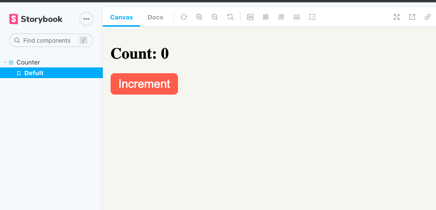
And well, if you run your storybook now it should look like this:

I think that’s all for today! Next article we’ll talk about Jest.
See you later!
Github: Vite Setup